
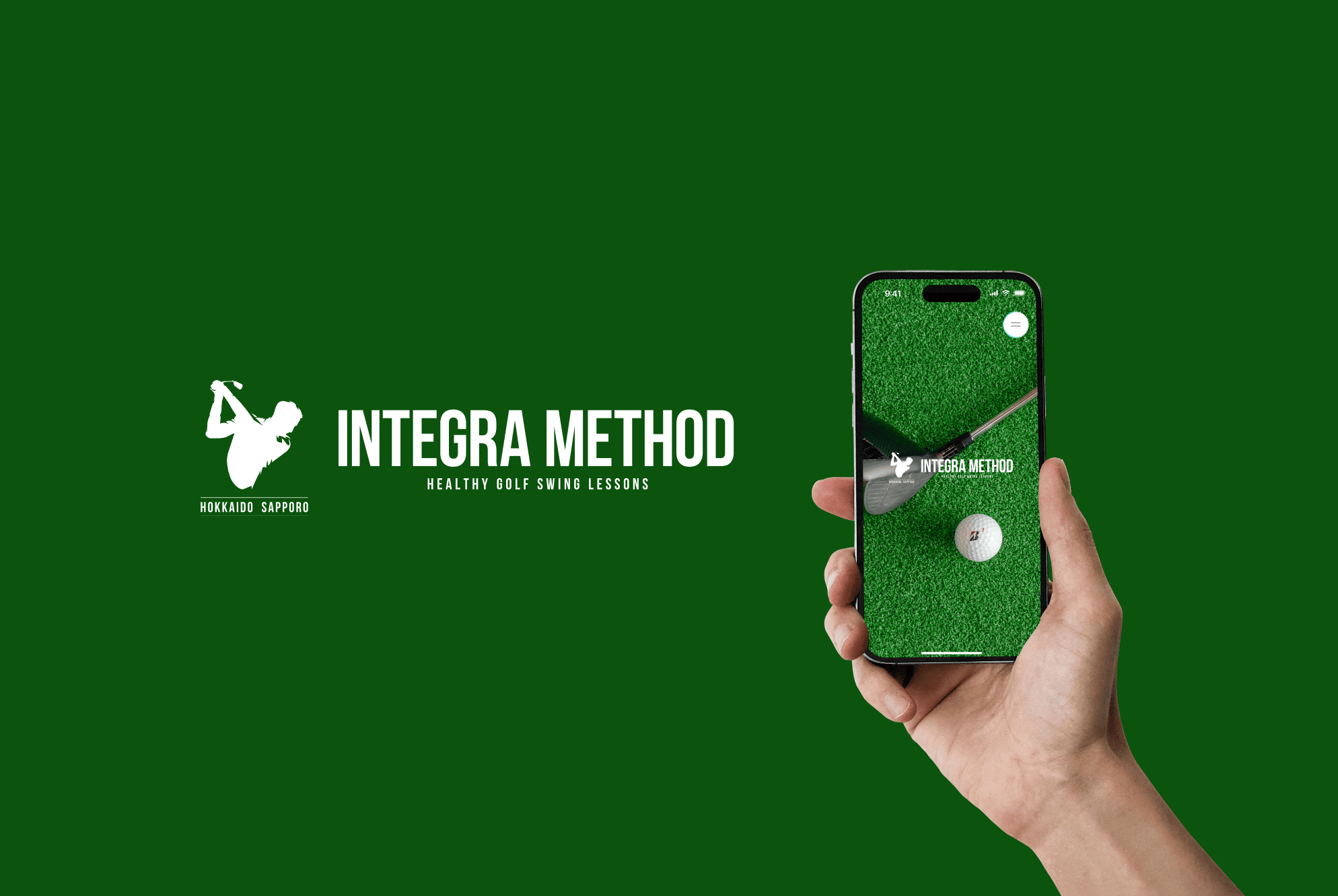
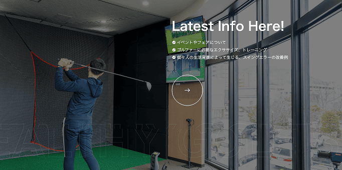
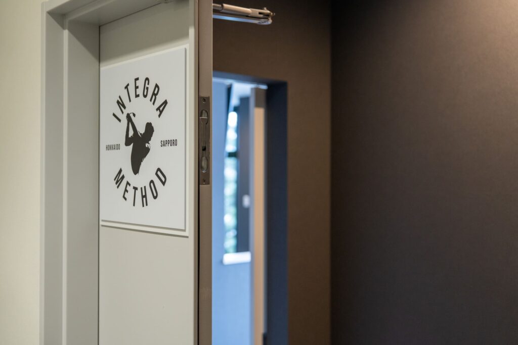
インドアゴルフスクール INTEGRA METHOD様のオフィシャルサイト制作を担当させていただきました。
多くの方がイメージするような「ゴルフらしさ」にとらわれず、高級感あふれる店内イメージと世界観を統一し、アパレルブランドのようなイメージでデザインを行いました。
I was in charge of creating the official website for the indoor golf school INTEGRA METHOD.
Rather than being limited to the "golf-like" image that many people have in mind, we unified the image of the luxurious store interior and world view, and designed it with an image similar to that of an apparel brand.
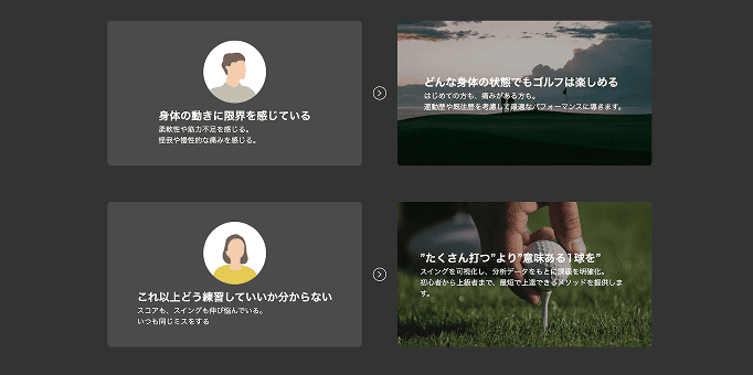
webは全体的にモノトーンで統一。
アクセントカラーが無い分、フォントサイズやフォントウェイト、余白取りや色味でデザインにメリハリをつけ、見てほしい情報への視線誘導を誘発するよう意識してデザインを行いました。
The website is unified in monotone throughout.
Since there is no accent color, we added contrast to the design through font size, font weight, white space and color, and were conscious of designing to guide the viewer's eye to the information we wanted them to see.
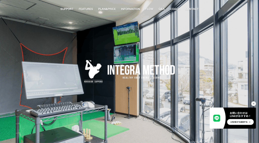
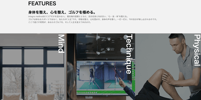
全体的なブランドイメージの統一を重視しつつも、わかりやすさや操作性など王道の配慮にも気を配りました。
ボタンのサイズはデジタル庁の基準をベースに「押しやすさ」や「ボタンらしさ」を大切にし、アクセシビリティにもきちんと意識を向けながらコーディングを行いました。
While placing importance on unifying the overall brand image, we also paid attention to standard considerations such as ease of understanding and operability.
The button size was based on the Digital Agency's standards, and we placed importance on "ease of pressing" and "button-likeness" while coding with a strong awareness of accessibility.
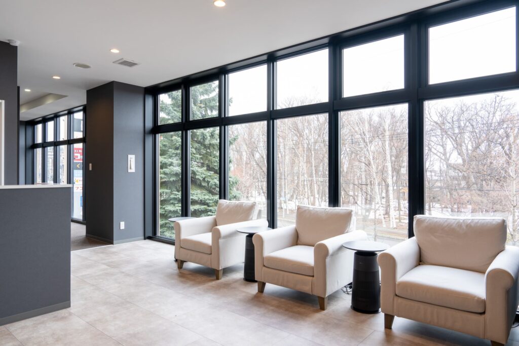
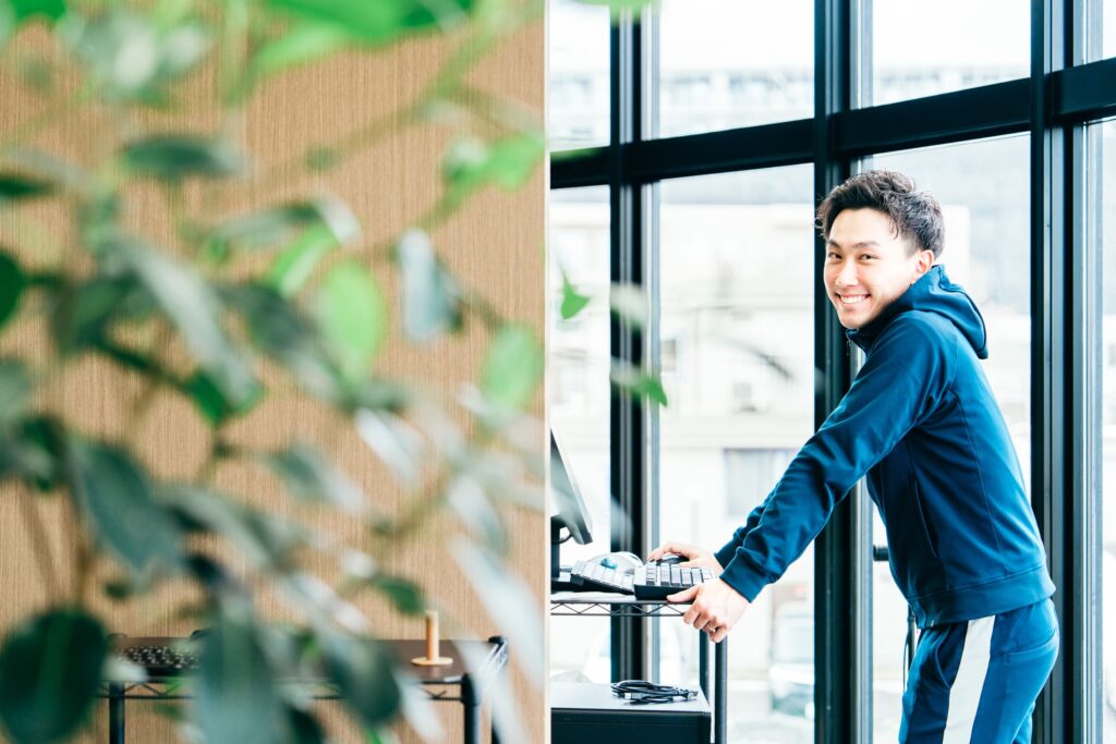
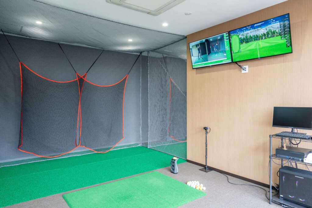
本件では撮影も担当。
広角域は24mmを最小値とし、歪みの最小化に努め、実態近似撮影を意識しました。
窓が大きく、開放的な店内の魅力が画像を通して伝われば幸いです。
ご依頼いただきありがとうございました!
I was also in charge of the photography for this project. I used a minimum wide-angle of 24mm and worked to minimize distortion and capture the image as close to reality as possible.
I hope that the images convey the charm of the open, spacious interior with large windows.
Thank you for special request!