
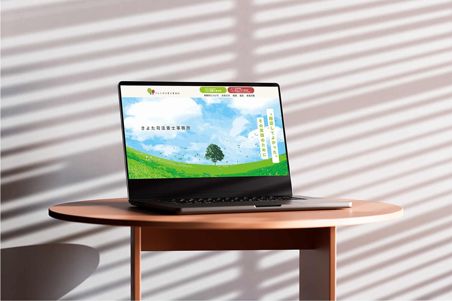
札幌市清田区を中心に活動される司法書士事務所「きよた司法書士事務所」様のオフィシャルサイト制作をEVで担当させていただきました。
ロゴやVI設計など初期段階から包括的に弊所で担当させていただき、媒体を超えたワールドビルディングを展開することができました。
EV was in charge of creating the official website for the Kiyota Judicial Scrivener's Office, a judicial scrivener's office based in Kiyota Ward, Sapporo.
Our office was in charge of everything from the early stages, including logo and VI design, and we were able to develop a world-building that transcended mediums.
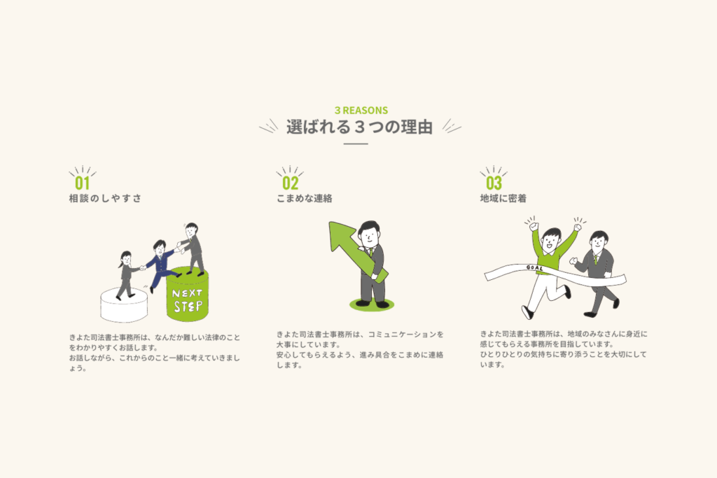
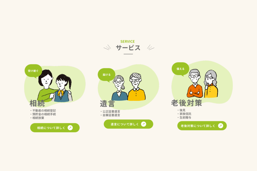
「相談のハードルを下げたい」という事務所の想いに沿って、親しみやすさをデザインでは重視しました。
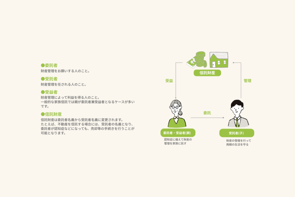
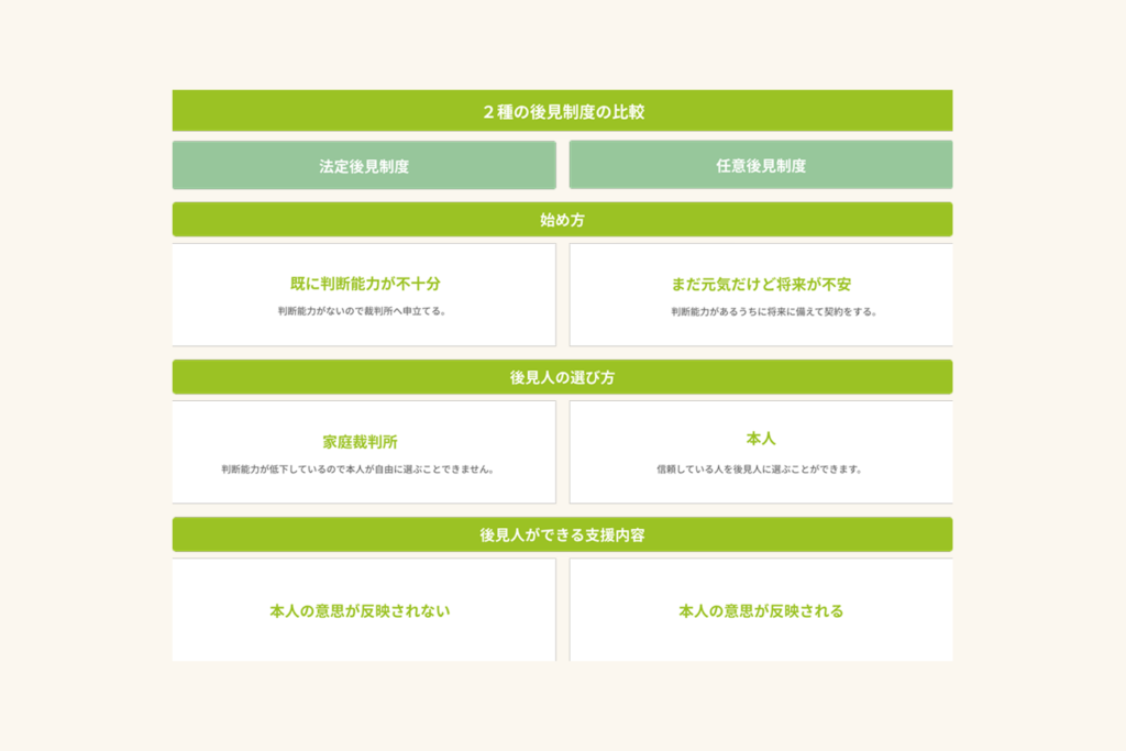
特に難しい内容は表や図を用いて情報を整理し、士業独特の堅さをなるべく前面に出さないよう工夫しました。
In line with the firm's desire to "lower the barrier to consultation," we placed emphasis on making the design approachable.
For particularly difficult content, we used tables and diagrams to organize the information, and we were careful to avoid bringing out the stiffness that is typical of the legal profession.
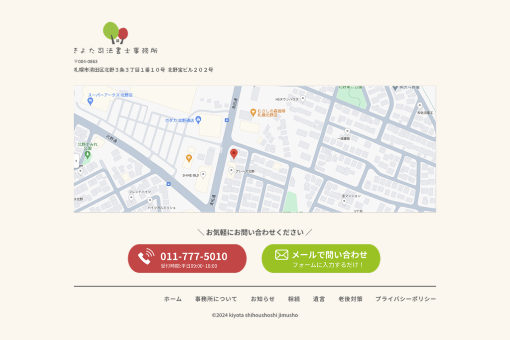
配色は「親しみやすさの演出」を大前提としながらも視認性やコントラストなどのアクセシビリティにも配慮。
メインターゲット層からの主の問い合わせが「電話」であることからアクセントカラーの赤は電話発信ボタンのみに使用しています。
The color scheme was designed with the primary goal of creating a friendly atmosphere, while also taking into consideration accessibility such as visibility and contrast.
Because the main type of enquiries from the main target demographic are made via telephone, the accent colour red is only used for the telephone call button.